Haus of Tint

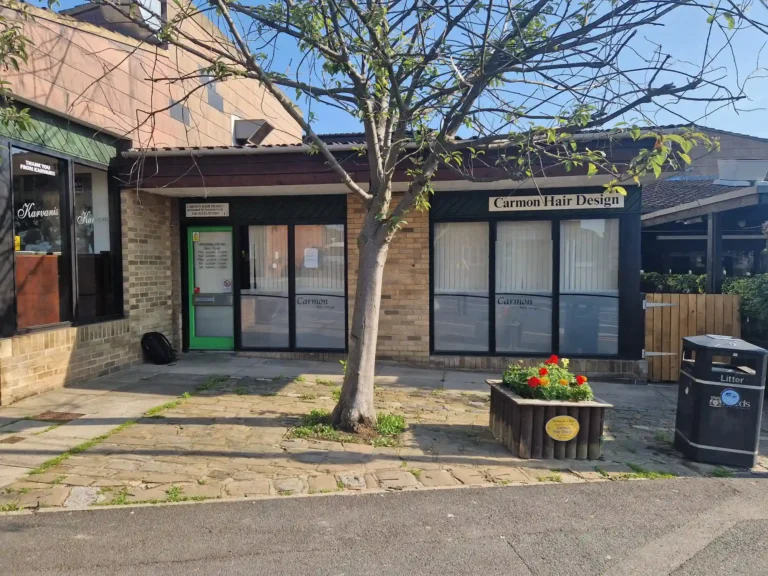
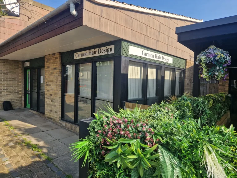
Phase 1: Removal of Old Signage
Our team at Brand Works worked closely with Haus of Tint to develop a comprehensive signage solution that would reflect the salon’s fresh and contemporary brand identity.
Before we could begin the installation of new signage, we carefully removed the old, outdated signs. Our experienced team utilized specialized techniques to ensure a clean and efficient removal process. This included:
Safe Removal: We employed safe and effective methods to dismantle the old signs, minimizing any potential damage to the building’s surface.
Surface Preparation: After removal, we meticulously cleaned and prepared the surface to create a smooth and pristine canvas for the new signage.


Phase 2: Design and Manufacturing
The next phase focused on creating the permanent signage, culminating in a striking 12-meter illuminated flex face sign.To ensure perfect brand alignment, we powder coated the sign in NHS blue, adhering to their exact color guidelines. This attention-grabbing piece required a custom-built framework to support its size. Going above and beyond, we took on the engineering and construction, working closely with the site’s structural engineer to design and install a robust steel structure. The result is a visually stunning and structurally sound sign that elevates the building’s presence.
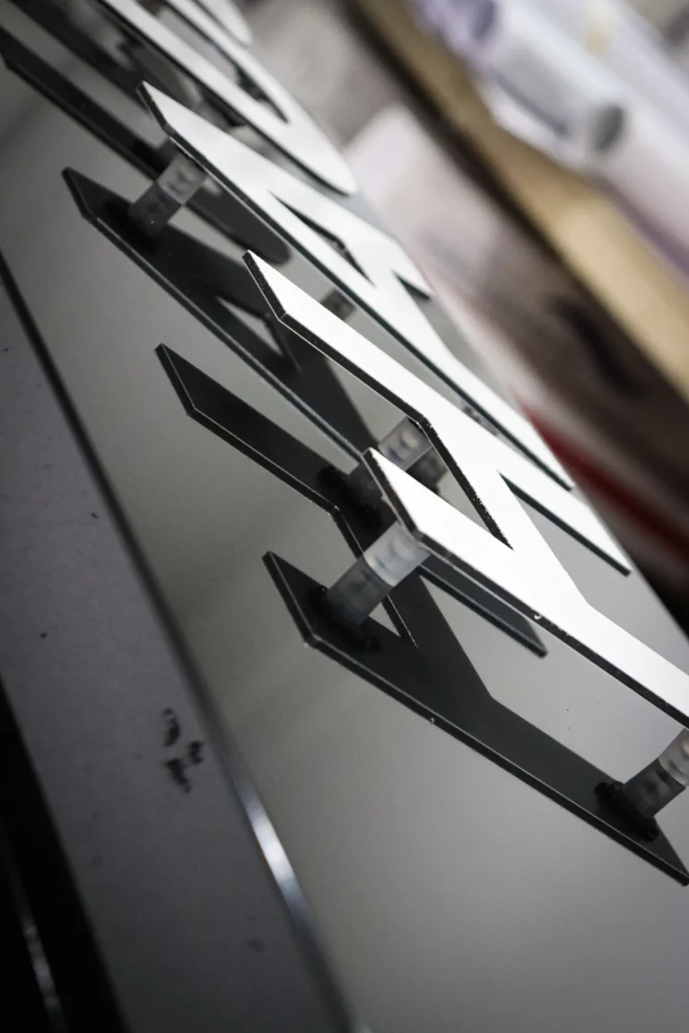
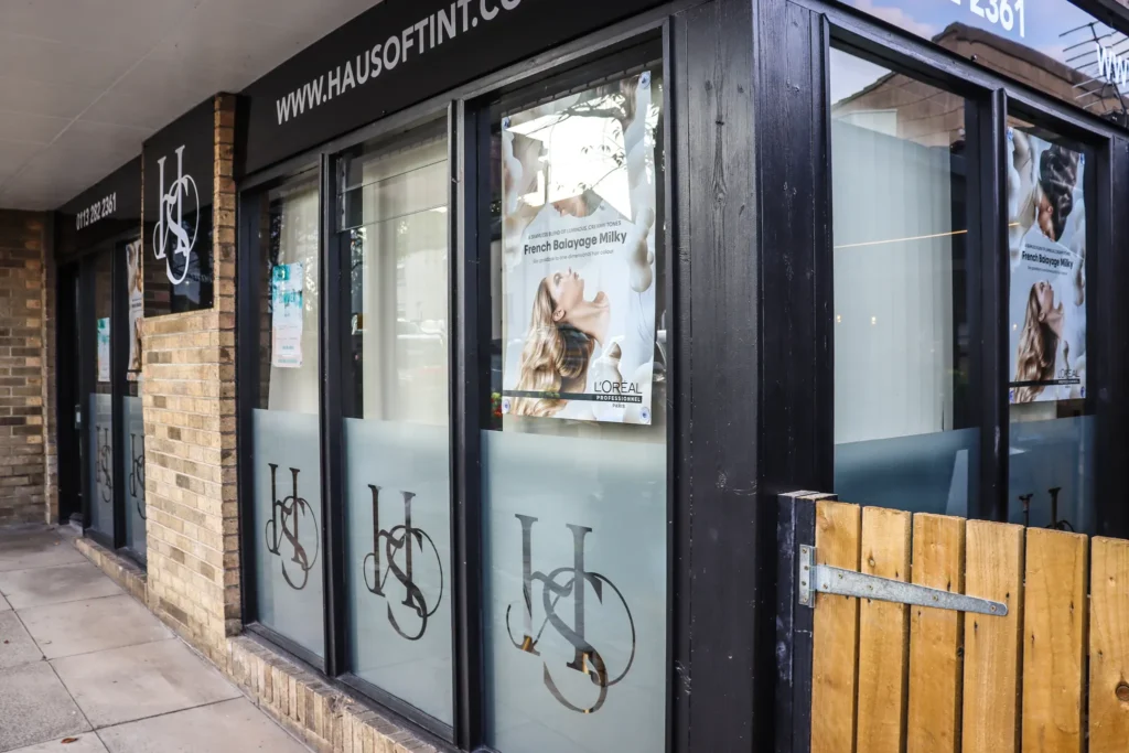
In addition to the main sign, we installed projecting signs and completed the project with high-quality window graphics featuring printed frosting and clear vinyl. The flex face design offers a practical advantage: when it’s time for a refresh,only the graphic needs replacing, not the entire sign. This cost-effective and efficient solution is a popular choice among retailers in retail parks.


Phase 3: Installation
Once the signage elements were manufactured, our expert installation team carefully installed them on the building’s facade. We ensured that the signs were securely fixed and aligned perfectly, creating a professional and polished appearance.
The successful completion of this signage project has transformed the Haus of Tint storefront into a modern and inviting space. The new signage not only enhances the salon’s brand identity but also creates a lasting impression on potential customers.
By effectively removing the old signage and installing a fresh, contemporary signage solution, we have helped Haus of Tint make a strong first impression and establish its presence in the Woodlesford community.


